Sarah Schöttler
Hi, I'm Sarah! (she/her)
I'm an Assistant Professor in the Visualization cluster at Eindhoven University of Technology in the Netherlands. My research focuses on responsive visualization: the design and implementation of visualizations and maps that automatically adapt across a variety of different devices and display sizes. I completed my PhD in the Visual+Interactive Data group at the University of Edinburgh in 2025, researching complexity in responsive visualization—how to make thematic maps and other complex visualizations flexibly adapt to different devices. Prior to this, I completed an MSc in Design Informatics (2019) at the University of Edinburgh, and a BSc in Technology and Liberal Arts & Sciences (2017) at the University of Twente. I design and develop interactive maps and visualizations, primarily for my research, but I also have experience working with academic and industry clients.
News
- November '25: I had a great time at IEEE VIS in Vienna (my first time attending in person!) and presented our TVCG paper on Constraint-Based Breakpoints for Responsive Visualization Design and Development.
- July '25: I started as an Assistant Professor in the Visualization cluster at TU Eindhoven!
- I'm giving a talk at the Data Viz Social Club on June 19th, 2025, in The Hague, titled “Learning from practitioners as a responsive visualization researcher” 💫
- May '25: After moving to the Netherlands earlier this year, I returned to Edinburgh to defend my PhD thesis. I passed my viva with minor corrections, officially making me Dr. Schöttler! 🎓
- March '25: I finally submitted my PhD thesis, titled “Dealing With Complexity in Responsive Design: Thematic Mapping and Visualization Across Varied Devices” 📕
- I will be a student volunteer and present my paper at VIS
in Floridaon Zoom this October, see you there 🌴 - July '24: I have a paper accepted at VIS 24! Practices and Strategies in Responsive Thematic Map Design: A Report from Design Workshops with Experts
- June '24: I have a new paper out in TVCG: Constraint-Based Breakpoints for Responsive Visualization Design and Development
- Nov '23: We hosted the Information+ conference in Edinburgh — I helped organize as one of the social co-chairs.
- Sept '23: I started as CDCS Training Fellow; this semester I am running several workshops/short courses: Introduction to Python, Introduction to git and GitHub, Creating your personal website with GitHub Pages, and LaTeX and Overleaf.
- Aug '23: I attended the INTERACT Doctoral Consortium.
- May '23: I attended Outlier in Porto.
- May '23: Jinrui Wang and I won the CDCS Digital Research Prize for Best Data Visualisation for our work for PeaceRep! 🏆
- Mar '23: I passed my 2nd year review.
- Mar '23: Our paper "NetworkNarratives: Data Tours for Visual Network Exploration and Analysis" (open pdf on arXiv) is accepted to CHI!
- Feb '23: I wrapped up work on an interactive Ukraine conflict map for PeaceRep.
- May '22: I passed my first year review, making me a PhD candidate!
- Nov '21': I published a GitHub template for the filterable collection website I developed for the geographic network visualization survey.
- Aug '21: I finally moved to Edinburgh after working remotely for the first months of my PhD due to the pandemic.
- Apr '21: I (re)joined the DVS Board as Knowledge Director for the remainder of the 2021-22 term.
- May '21: I (virtually) attended and presented my STAR on geographic network visualization at Eurovis.
- Feb '21: My survey of geographic network visualization techniques is now published in CGF (open access)!
- Jan 2021: Started my PhD at the University of Edinburgh.
Older news
Publications
Tomas Vancisin, Jinrui Wang, Niamh Henry, Sarah Schöttler, Lucy Havens, Tobias Kauer, Sanja Badanjak, Christine Bell, and Benjamin Bach. Visualizing Peace Transitions: Interactive Visualizations to Support Innovation and Adaptive Management in Peace Processes. Poster at IEEE VIS (2025.)
Jonas Oesch, Sarah Schöttler, Joana Kelén, and Arzu Çöltekin. Thematic world maps in the news: How effective are they on smartphones? The Cartographic Journal (2025).
Sarah Schöttler, Uta Hinrichs, and Benjamin Bach. Practices and Strategies in Responsive Thematic Map Design: A Report from Design Workshops with Experts. IEEE Transactions on Visualization and Computer Graphics (2025). Companion Website | Conference Talk (VIS 2024)
Sarah Schöttler, Jason Dykes, Jo Wood, Uta Hinrichs, and Benjamin Bach. Constraint-Based Breakpoints for Responsive Visualization Design and Development. IEEE Transactions on Visualization and Computer Graphics (2025). Demo Website
Wenchao Li, Sarah Schöttler, James Scott-Brown, Yun Wang, Siming Chen, Huamin Qu, and Benjamin Bach. NetworkNarratives: Data Tours for Visual Network Exploration and Analysis. Proceedings of the 2023 CHI Conference on Human Factors in Computing Systems (CHI '23). Demo Website
Sarah Schöttler, Yalong Yang, Hanspeter Pfister, and Benjamin Bach. Visualizing and Interacting with Geospatial Networks: A Survey and Design Space. Computer Graphics Forum, 40: 5-33 (2021). Project website | Conference Talk (EuroVis 2021)
Arran Ridley, Sarah Schöttler, Aba-Sah Dadzie, and Benjamin Bach. The VisTools Marketplace: An Activity to Understand the Landscape of Visualisation Tools. Proceedings of the 2020 IEEE VIS Workshop on Data Vis Activities to Facilitate Learning, Reflecting, Discussing, and Designing (2020).
Sarah Schöttler, Tobias Kauer, and Benjamin Bach. Geographic Network Visualization Techniques: A Work-In-Progress Taxonomy. Poster at Graph Drawing (2019). Project website
Selected Projects
An overview of my map and visualization design and development work.
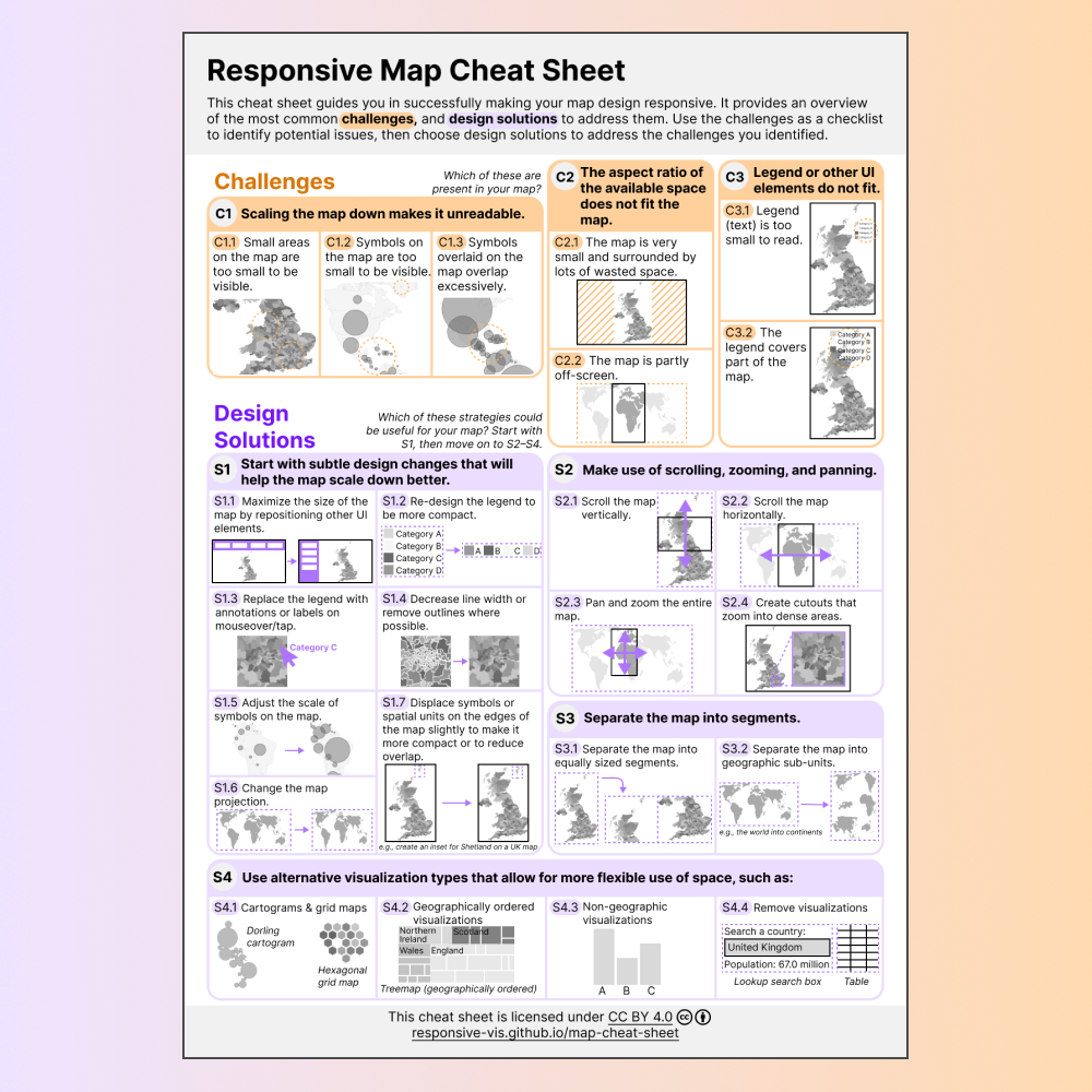
Responsive Thematic Mapping Cheat Sheet
July 2023–July 2024Based on interviews and design workshops with visualization and thematic mapping practitioners, I developed a cheat sheet showing common challenges in responsive thematic mapping, and possible design strategies for addressing them.
VIEW READ MORE
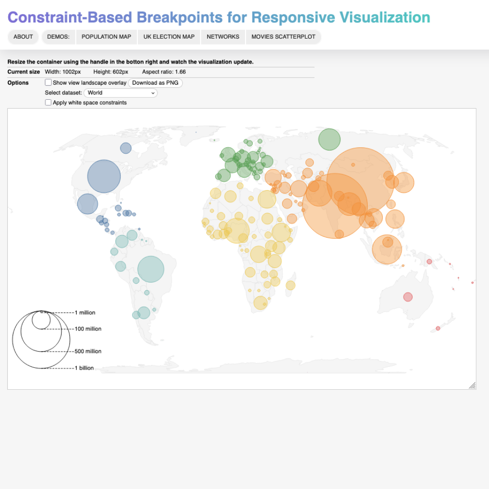
Constraint-Based Breakpoints Demo & Toolkit
July 2021–July 2024We developed the concept of constraint-based breakpoints, a new technique that makes responsive visualizations more reliable, flexible, and resilient to changes in the underlying data. Our demo website shows interactively resizable example visualizations, created with our toolkit, which includes a prototype library, the view landscape diagram, and suggested workflows for visualization developers.
VIEW READ MORE

Conflict Map: Ukraine
March 2022–February 2023I worked with researchers at PeaceRep at the University of Edinburgh to develop an interactive map bringing together various datasets that document different aspects of the war in Ukraine. For this visualization, I won the Best Data Visualisation award at the CDCS Research Prizes in 2023.
VIEW

Visualizing Real-Time Opinion Data
August–November 2020I developed a sequence of mobile-focused prototype visualizations for Say As You Go, a startup aiming to show people's perceptions and opinions in real-time.
VIEW
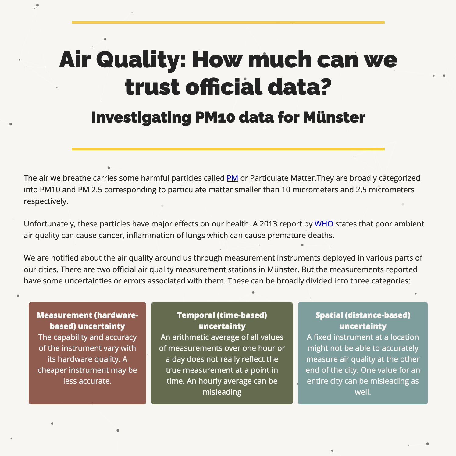
Visualizing Air Quality
October 2019–February 2020In a student group project, we collected air quality data in Münster, Germany. We then created a website discussing uncertainty in this data, as well as an AR application visualizing different levels of air quality in your environment. I designed and implemented the scrollytelling website, and developed two out of the three maps shown on the page.
VIEW

PaxVis: Visualizing Peace Agreements
February–May 2019I created an interactive interface for the PA-X database, which contains data on over 1500 peace agreements.
VIEW READ MORE

Inequality in NHS Health and Care Experience
November–December 2018In a group project for my MSc in Design Informatics, we created a visualization of inequalities in Scottish healthcare experiences, based on survey data published by the Scottish government.
VIEW

Dot Map Generalization (BSc Project)
April–June 2017For my Bachelor project, I developed an algorithm to generalize dot maps with the goal of making web-based marker maps more readable.
VIEW