Sarah Schöttler
PaxVis: Visualising Peace Agreements
This project was done as part of my degree in Design Informatics. This blog post was also published on the Design Informatics Blog.
Context
The PA-X database is a collection of more than 1500
peace agreements and related documents, created by the Political Settlements Research Programme (PSRP) at the University of Edinburgh. For each agreement, the database contains information such as the title,
who it was signed by, when it was signed, and the conflict it relates to as well as scores for 225
categories describing topics discussed in the agreements, e.g. Women, Girls and Gender
.
This database is an invaluable asset for researchers, policy makers, conflict mediators, NGO’s,
and more.
The main method of accessing the database is through a search interface on the PA-X website, which is helpful for finding specific agreements and their associated information, but less helpful for answering exploratory, open questions. To mitigate this, an interactive visual interface to the database was created by Lucy Havens and Mengting Bao in 2018.
In the past months, I have updated, refined and extended this visualisation considerably to better suit its purpose. The visualisation needs to complement the search interface and provide functionality the search interface cannot offer. Accordingly, it should encourage exploration – getting a general overview of the data and finding potentially unexpected correlations and connections – across all dimensions of the data, but in particular across time and space. It needs to be designed such that it is intuitive to use by people with potentially no prior experience with interactive visualisations, yet able to provide enough detail to satisfy domain experts.
Design Opportunity in short: PaxVis - Creating an interactive, visual interface to the PA-X Database, focused on exploration and connection.
Research & Design Process
Overall process
I began by delving into the existing PaxVis website (see Figure 1) and accompanying blog posts and documentation. I identified aspects worth keeping, but also components that should be removed or replaced in ways that better serve their intended purpose. Then, I began researching solutions and redesigning those components.
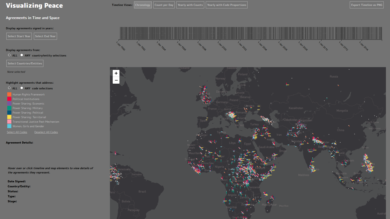
I decided to keep the overall structure of the page because it allows for displaying the spatial and temporal dimension separately: a map as a central piece, a horizontal timeline above, and a sidebar with filters on the left. Filters are a necessity for a dataset this size, and their overall structure allowed for many different permutations while not being overwhelmingly complex. Yet, each of the three components (filters, timeline, map) had issues which required attention. It quickly became obvious that the map would require an extremely customised solution, which is why I tried to keep the other components relatively basic so as not to overwhelm users.
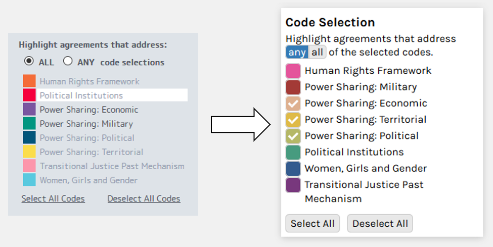
Filters
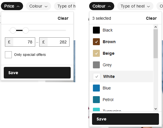
Filtering and searching are basic interaction techniques frequently used to navigate large datasets. There are many mundane applications for filters, e.g. online shopping sites. Therefore, it is reasonable to assume users are familiar with the basic,built-into-HTML, input types (such as sliders, dropdown menus, or checkboxes) as well as slightly modified versions thereof, as shown in Figure 2.
For redesigning the filter sidebar for PaxVis, I determined the following criteria:
- Space-saving: The filters are not the centrepiece of the website, so they should take up no more space than required.
- Intuitive to use: They should all be clearly labelled variations of commonly used input designs, so that users understand how to use them more easily.
- Ease of use: The user might want to change filter settings many times, so unnecessary scrolling and clicks should be eliminated.
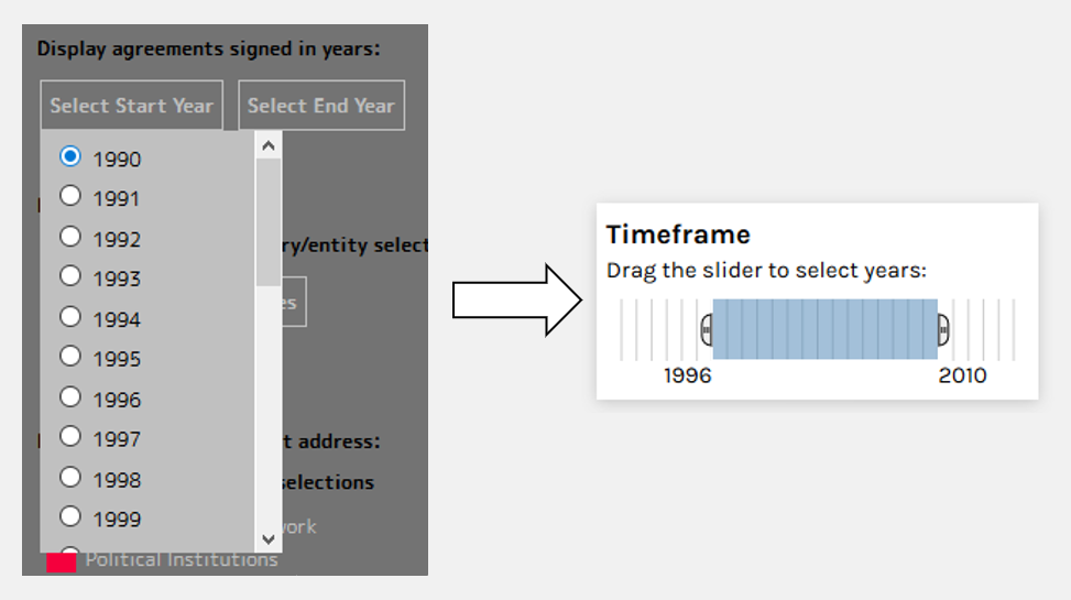
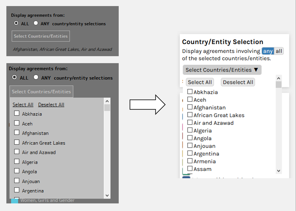
Figures 3 - 5 show the updated filter designs that resulted from these criteria.
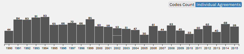
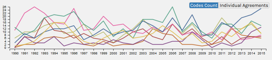
Timelines
The timeline’s purpose in this interface is to visualise the temporal component of the data, mainly in terms of number of agreements and their code scores. Previously, there were four different timelines, each showing a slightly different aspect. The main issue was that the designs, while in theory good, were not suitable for showing a dataset this size in the allocated screen space. They were all based on showing each agreement as a separate rectangle, resulting in many elements being smaller than 1px. This makes them appear blurry and their associated mouseover effects impossible to trigger.
Figures 6 and 7 show the two timelines included in the updated interface.
Map
To show the spatial dimension of the agreements – 1500 multivariate data points – a map was used as the centrepiece of the website. The data is complex in multiple ways:
- With more than 1500 agreements, it is a relatively large dataset.
- Multivariate data: For each agreement, there is lots of additional data. Most of this is not included in the subset of the data used for the visualisation, but there are still scores for eight different codes as well as the title, the peace process it is part of, etc.
- Network character: Through co-signing agreements, countries form a network.
This poses certain challenges for the visualisation. Most of these were not addressed successfully in the previous version, so it was clear that the map would require a complete redesign.
- Overlap: Possibly the easiest design would be to place each agreement onto the map as an individual glyph (a symbol representing part of the data). The large number of agreements makes this impossible to realise without excessive overlap and crowding. Reducing the size of each individual glyph can reduce overlap, but also makes glyphs difficult to hover over or click to obtain additional information.
- Performance: Displaying more than 1500 symbols, especially complex ones, slows down the website enormously.
- Positioning: Each agreement is associated with one or more countries. There is a trade-off between displaying agreements multiple times vs. arbitrarily choosing which country to display it in, further complicated by some signatories not being recognised countries. Arbitrary positioning might also mislead the user to attribute meaning to the precise location.
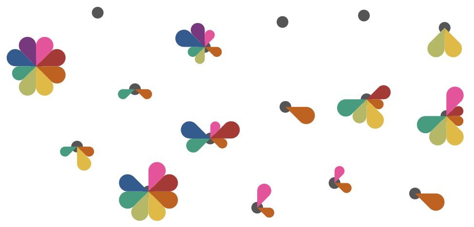
Glyphs
This dataset is a typical use case for glyphs – there are many data points, and we want to show some data (the code scores) for each of them. However, placing the glyphs directly on the map is not a good solution due to the issues with overlap and arbitrary positioning.
As for the shape of the glyph, there has been research on the effectiveness of different glyph designs. However, no generalised recommendation on which glyph types are best has been made. There are
some practical constraints – since many agreements have scores of zero for all codes, a glyph that
does not disappear entirely in such a case must be chosen. This excludes for example star glyphs.
Circular glyphs (pies
or flowers
) seem to be a reasonable choice. The glyph used to
represent agreements is shown in Figure 8.
Interactivity
Shneiderman’s Visual Information-Seeking Mantra is probably one of the most frequently cited quotes in information visualisation:
“Overview first,
zoom and filter,
then details on demand”
As an abstraction of more specific design guidelines, it offers a helpful scaffold for designing visualisations of complex data. Additionally, I researched interaction techniques. I decided to sacrifice some detail in the initial view to provide a better overview by displaying a simple dot map only. To provide "details on demand", I created a separate visualisation layer which is shown in Figure 9.
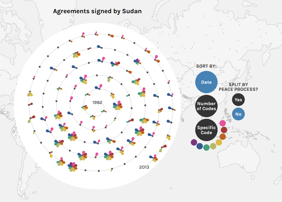
This solution addresses multiple challenges at once: no overlapping glyphs, lower chance of the user attributing meaning to the position of the dots, and faster rendering.
The table below shows an overview of the interaction techniques used in the final version of PaxVis.
| Interaction Technique | Implementation |
|---|---|
| Multiple Views | The map and timeline are two different views. Additionally, there are two different timelines. |
| Zoom | The map can be zoomed. |
| Filtering / Dynamic Queries | The filter sidebar on the left allows for filtering by date, country/entity, and code scores. The visualisations update instantly when a filter is changed, making them dynamic queries. |
| Details on demand | An “Agreement Details” box is displayed when hovering over/clicking a glyph/timeline bar. Clicking a country on the map will open a separate view showing each agreement as a separate glyph, with some sorting tools. |
Table 1: Interaction Techniques
A common problem with interactive visualisations is that the users don’t make use of the extended features. To create incentives for interaction, mouseover effects (e.g. colour changes, size changes) are being used, so that simply moving the mouse around already reveals some additional information, and at the same time hints at there being more to see when the element is clicked. However, user testing would be required to evaluate how effective these measures really are.
Complexity
The final design is relatively complex through the multiple layers that can only be accessed through interacting with the visualisation. However, the different parts of the visualisation function separately from each other, so that users do not need to use all of the features to get value out of the visualisation.
Other changes/considerations
Minor layout changes. The sidebar and timelines were made narrower to create more
space for the map. The Agreement Details
box was moved from the bottom left to the top right
to be able to make the sidebar narrower, and, as requested by the PA-X researchers, to draw more attention
to it.
Redundant controls. In several instances, there are multiple ways of doing the same thing. For example, the map can be zoomed by scrolling or by using the +/- buttons in the bottom right. This is so that anyone will find the controls they are looking for, but more proficient users can still use shortcuts.
Performance. A major issue with the previous version of PaxVis was performance and loading time, which is why this was made a focal point in this update. Under the hood, the website was almost entirely rewritten to optimise for performance. Some examples of measures taken are:
- The visualisations were created with D3.js, not using any additional JavaScript libraries to keep it as lightweight as possible. The Leaflet map was replaced by an SVG version to allow for smoother zoom.
- Transparent SVG elements are computationally expensive to render, so they were used sparingly and avoided for repeating elements like glyphs on the map.
- The dataset was pre-processed to cut out any columns that are not required, and only loaded once, then cached.
Final Product
The live visualisation can be viewed here: https://sarah37.github.io/pax/
The video below demonstrates and explains the different functions.
Direct video link: https://www.youtube.com/watch?v=PGv5BsS8MF0
References
All references are linked directly in the blog post. Below is a list of all references and other external links in this blog post.
Links
Political Settlements Research Programme
PaxVis 1.0 Additional Documentation
References
Baur, D. (2017). The death of interactive infographics? Accessed 2019-05-09.
InfoVis Wiki. Category:Interaction Techniques. Accessed 2019-05-09.
w3schools.com (2018). HTML Input Types. Accessed 2019-05-09.
PA-X (2017). Peace Agreements Database and Access Tool, Version 1. Political Settlements Research Programme, University of Edinburgh, Edinburgh. www.peaceagreements.org
Fuchs, J., Isenberg, P., Bezerianos, A., & Keim, D. (2017). A systematic review of experimental studies on data glyphs. IEEE transactions on visualization and computer graphics, 23 (7), 1863-1879.
Shneiderman, B. (1996). The Eyes Have It: A Task by Data Type Taxonomy for Information Visualizations. In Proceedings of the 1996 IEEE Symposium on Visual Languages (p. 336). IEEE Computer Society.